

this is the basic idea of what it was that I wanted to show in the final render, though its obscured by my ability to draw the point comes across that it will be a scene from a very specific angle and should add an element of intimidation for the viewer as the scene is dark and menacing. The high society nature of it should also be apparent like I have tried to show in my drawing with various wine glasses and candles for the mood of the scene to develop around to make it darker and ultimately scarier for the viewer. This goal I think was achieved in the final render and therefore it was worth my time displaying the ideas in this way in order to communicate them to myself later on in the process

Eyeball

the eyeball was actually the second to last object that I made as I felt a bit overwhelmed by the look of it and was almost intimidated by it I couldn't for a while get my head around the shape of it and it was only in the last few days before the hand in that I slightly caught a hold of what it was that I was doing therefore I didn't really get a good chance to fully understand it and had to ask a lot of people for advice on various parts and how to make it meaning by the end of the project I still didn't really understand how I made it and therefore wouldn't be able to replicate it however this would likely be amended if I retried this part of the project a few times.

Spoon

The spoon was originally meant to be a ladle but I felt it didn't really fit the aesthetic and I couldn't get it to look modern enough it just fell a bit short, for this reason I decided to make it into a spoon and as they are a fairly comparable shape to one another the transition was quite a simple one, as I wanted it to be modern I kept the shininess and didn't make it look at all matted or apply a texture hopefully this gave the intended look of a metallic spoon but still black and sleek looking.

Goblet

The goblet was actually the first part of the project that I did as I felt like I would be able to understand it better than the eyeball which turned out to be true, however it doesn't really fit my design so therefore I wanted to try and make it feel like a slightly antique thing that a party host might use to show off to people who they had at their house, this was rly the only approach from a story perspective that seemed to make sense for the area that it was going to be in. I used the standard textures and then just upped the shine of it and made a balance that I seemed to find fitted the look I was going for.

Table top

the table top for me probably the simplest part of the project I found it quite easy as it is just a slightly extruded square, my current idea shows the table top as a sort of black stone surface and under the right lighting it should look black and less grey if all goes correctly but I added a slightly rougher texture to give it a bit of depth, this should mean that in the final render of all of the objects I made this should look like a believable stone surface. In the end I found a texture on a website called texture.com and this was a stone/marble surface so I increased the depth of it and changed the colour of it from brown to a dark grey/black this should help with the dark modern stone look that I am going for.

Soup

The soup was one of the shortest parts of the project for me as I didn't find it very complicated, the goal was to make the soup look like a professionally made soup so it couldnt look green or red or unappetizing or it had to look as appealing as possible for the soup to look, I chose a darkish brown colour as I remembered a soup I had eaten in the past, I felt this colour was most appropriate.

Plate

the plate was fairly simple to do so i thought that i could make it a little bit more interesting like adding a circular ripple texture that is clear in the image above. Again the goal was to make sure that it looks sleek and modern, the goal was to make a plate that is black and made of china hence choosing a partial shine with a mainly matted finish, this should guarantee a more realistic china finish, i made the plate slightly ovular to compare slightly to square cut slate that you tend to be served food off of in high end restaurants and again in high end dinner parties

Final Render
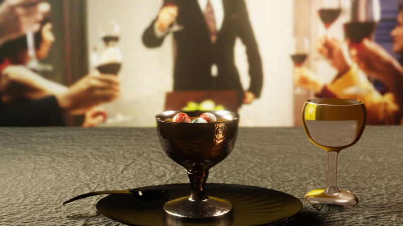
This is the final part of the process and was by far the longest, however I came out with a better looking result than I thought. For me the most drastic change that I saw was the lighting adding that and the HDRI element made a huge difference, my worry was that the table would look bare and cartoonish however I felt that I got the hang of it and the lighting seemed to do a lot of the work for me in that situation. I also added a wine glass to help blend the foreground with the background, I also had to edit the background as originally it was a crisp image and therefore the depth of field didn't look right so I changed this for an artificial alternative of just blurring the background using PowerPoint but in the end I worked the depth of field out and it made a more natural blend of the foreground and background, this made the final result more believable looking, if I were to improve this I would have likely changed the background so that it fit to the foreground even better by making sure the tables were matched up correctly this would have likely achieved a better look, I would also have done a wooden table top this one I chose was way harder to make look realistic than I anticipated so I believe a wooden one would have been easier to achieve.


Create Your Own Website With Webador